2014 Fall One Room Challenge || Week Two
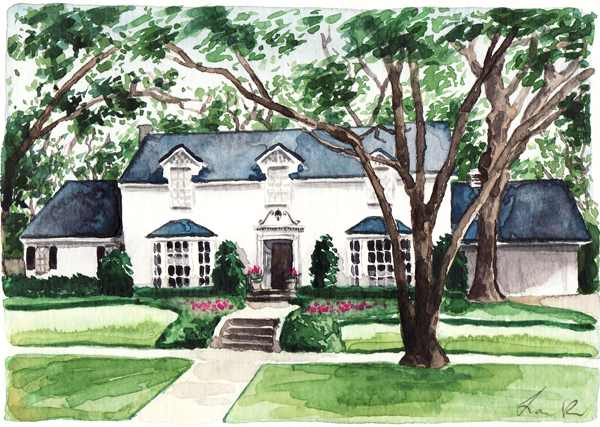
Thank you for visiting my Week Two of The One Room Challenge! If you missed Week One, go here. I'm redesigning my entrance hall, so it makes sense to start with the exterior. This is an illustration of our house painted by Laura Row. The walk up is clearly classic. My strong but inexperienced opinion is that what you see as you walk up to the house should be in keeping with what you're greeted with upon entering. Basically, I believe in flow.
To describe the style I prefer, I'd use the words classic, fresh, tailored, and understated. That's what I'm wanting in the entry. What I have now isn't fresh. In fact, it feels stuffy. It's what just happened when we moved in seven years ago and placed here what fit from the previous house.
Here's the before.
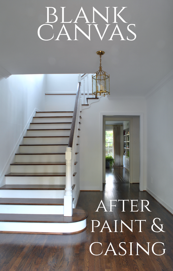
This is what our entry looks like this week. I'm so happy with the white paint. Seeing it empty like this helps me see the possibilities.
The sideboard that protruded into the walkway and made me feel claustrophobic has been moved to the dining room (another room on my redesign list). The china cabinet that was in this spot is now in the living room.
Now that the sideboard is gone, I have a large blank wall to fill. If you follow Christina Baker or me on Instagram, you'll already know how HUGELY EXCITED I am that she's creating art for my room.
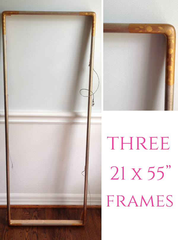
I purchased three of these Chinese frames years ago at an estate sale for $25 each. I had no idea what I'd do with them, but I knew they'd come in handy someday. They will fit perfectly on the blank wall in my entry, and I knew as soon as I had the idea to use them there that I wanted Christina to paint the panels that these would frame. I've been grateful to get to know Christina over the past year. She and I share a love of color, art, interior design and specific TV series. We discovered the mutual TV taste one day on Sherry Hart's Instagram. Isn't that fun?
Christina's painting is elegant and ethereal. I knew that her tasteful, subtle work would be perfect for the space, and I'm very appreciative that she took on this commission. I cannot wait to see these hanging. Below are a couple of her newest paintings.
Do you see why I'm beside myself with happiness? I'm going to want to gaze upon these constantly. Christina is sharing her process and some sneak peeks on her blog. Run over there to see more about my future wall of beauty : )
And if my wall of Christina Baker art weren't exciting enough, I'm going to share the news about the lantern. Prepare yourselves for astonishment. Below is a close up of my perfectly adequate, much too smal lantern. I posted here, last spring, about wanting a replacement, and I asked for readers' suggestions.
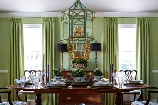
Several advised that I look into Coleen & Company, and I fell for The Audrey pendant shown in Suellen Gregory's dining room below. Everything Coleen has designed is incredible, but obviously, the Chinoiserie elements made the decision for me.
I reached out to Coleen to inquire about sizes and colors and mentioned my project. Well. Coleen is very adventurous. Imagine me, getting the email from her asking if I'd be interested in her custom designing a pagoda lantern for my entry inspired by my logo? After reading her email between four and five times, I replied back with a huge, "YES!!"
Of course, I spent some time picking apart my logo wondering which elements she'd use. I've since seen sketches and pictures as it has evolved. In fact, a week or so after our communication, she sent a sketch that absolutely thrilled me. This is going to be incredible.
I asked you this last week.
It's going on this settee, along with some lacquer. It will be across from the paintings and give me a spot on which to sit as I enjoy them endlessly. Care to guess what color lacquer?
Now, go see what these talented ladies are doing!
Trademarked by Calling it Home


