One Room Challenge: Spring 2015 Finale
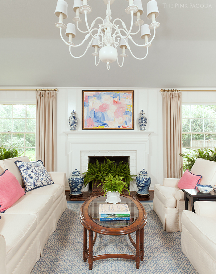
It's the final week of
Calling It Home's One Room Challenge Linking Event
, and I'm excited to share my project with you. This is the second time I've worked in this room as part of ORC. You can see the first project and the "before" images
.
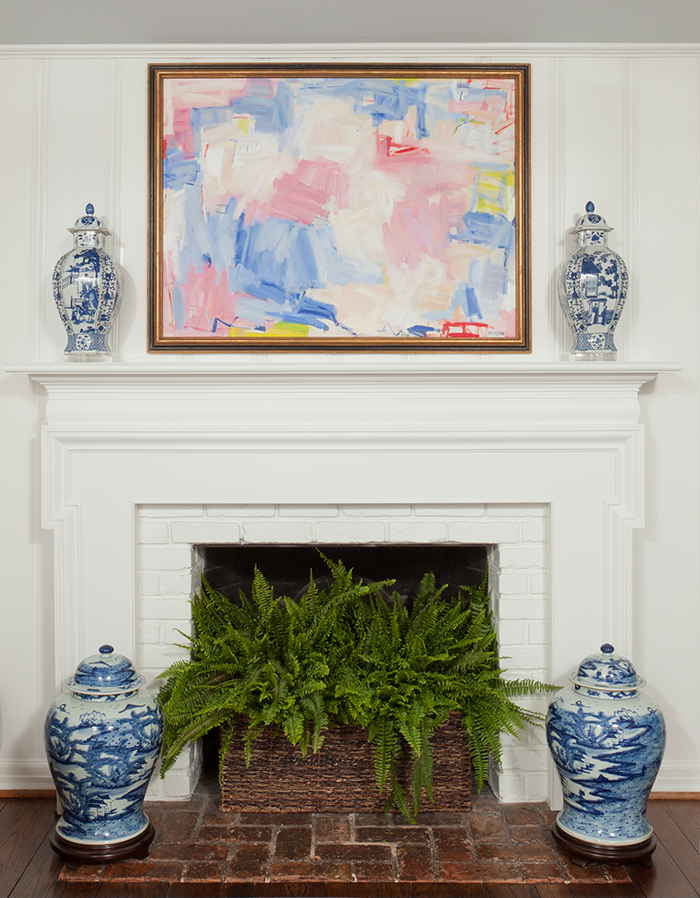
The focal point of the room is the mantel, and what's over it is unquestionably the most important element in the entire space. I couldn't be more thrilled with our new
painting. As the largest most visible aspect of the room, it was mandatory that this painting both work with what I already had, and be enough of a statement to function as the centerpiece. I knew Reagan could pull this off easily. She's amazing, and this piece is absolutely beautiful and perfect for our family room. Below are a couple of detail shots of the painting that I couldn't resist adding. Isn't this incredible?!



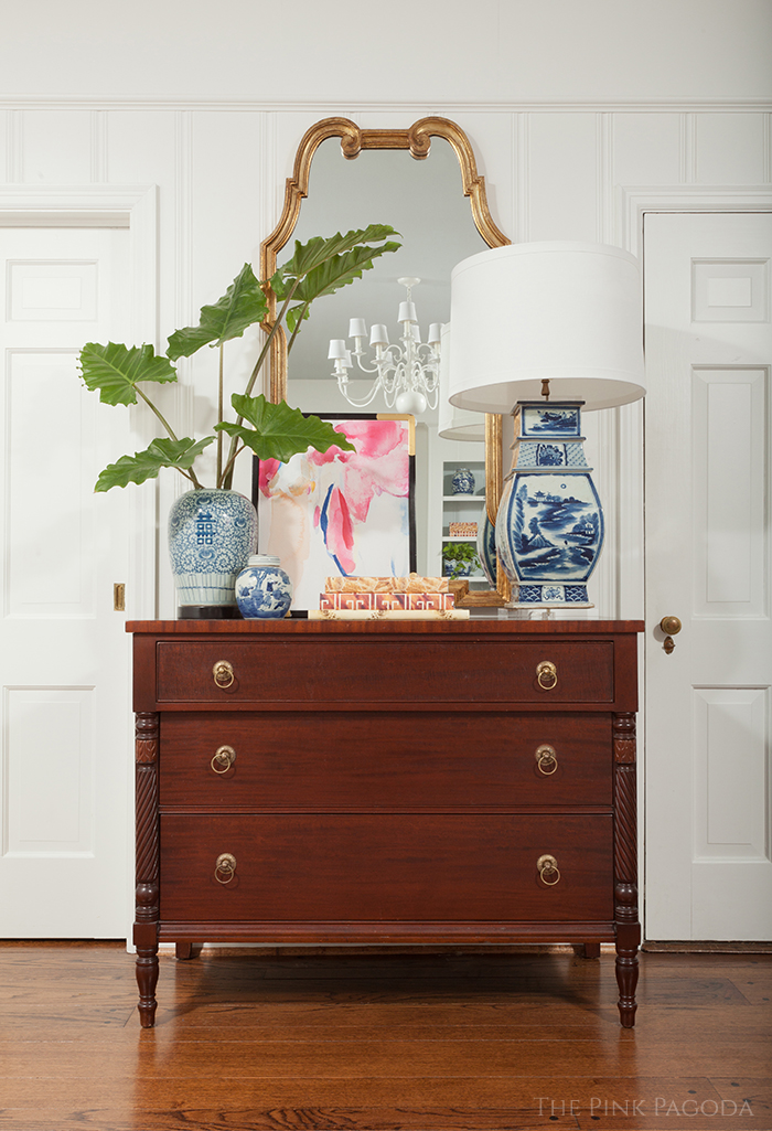
The painting leaning against the mirror on the chest is one of three fantastic watercolors
painted for this space. The last time I redesigned our family room, I ignored this wall. I'm so happy to finally have something happening on that side of the room, and Christina's paintings are the best part of it without a doubt.
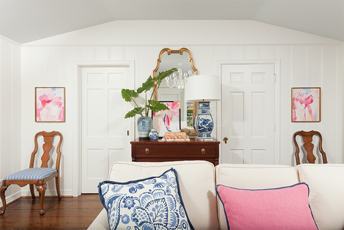
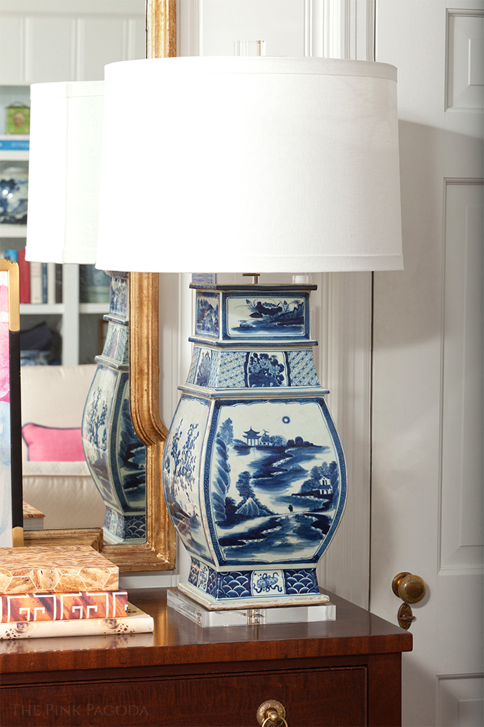
While my new lamp came as a bit of a shock, I've gotten used to it now, and love it. I ordered it completely misunderstanding its size. Not sure how that happened, but I was expecting a lamp a third smaller. The shade I'd intended to use looked actually laughable. Thank goodness for the very helpful and talented ladies at
who saved the day by finding the perfect size shade and this fantastic acrylic finial. If you're in the Dallas/Fort Worth area, I highly recommend them.
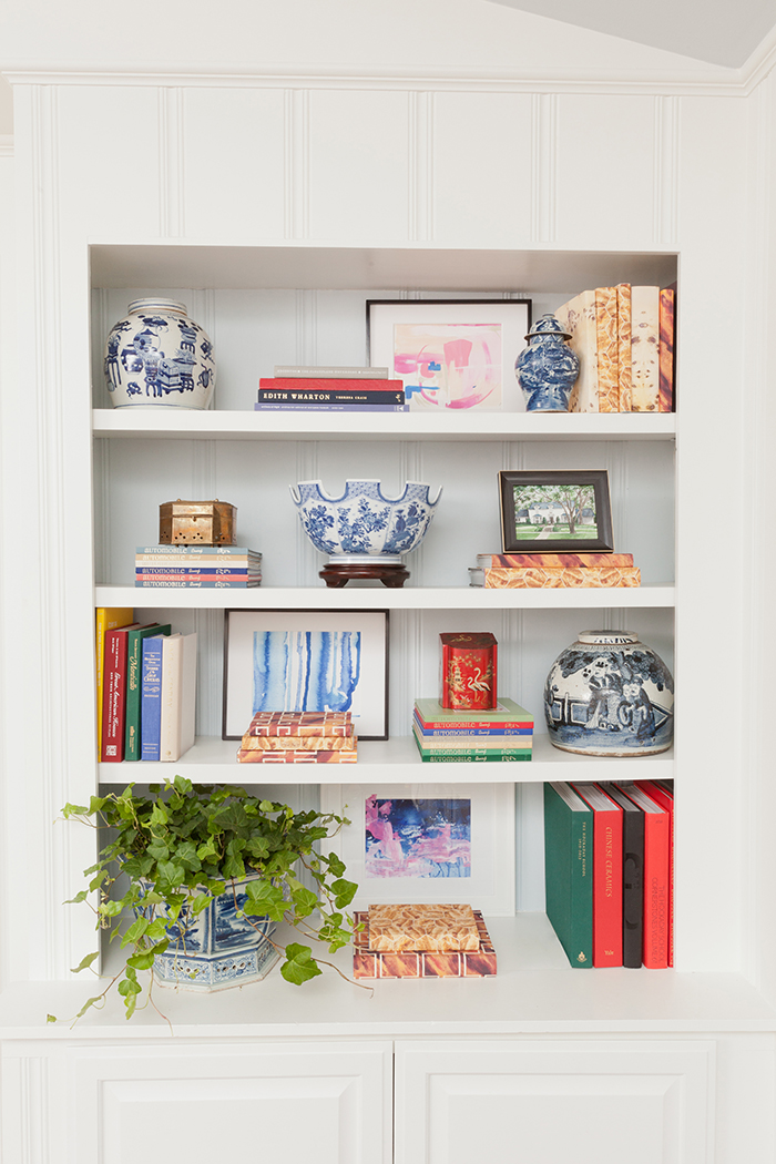
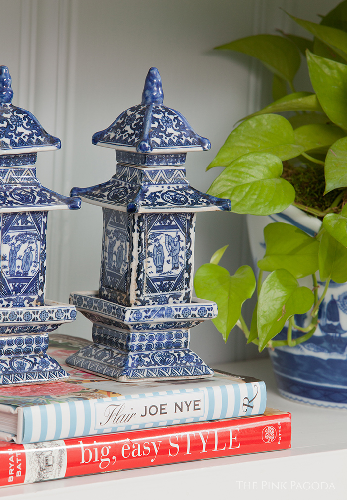
The bookcases are on the wall opposite. They were by far the hardest part of this for me. I have no experience styling, and find this type of job intimidating. For days I just stared at the shelves and my books/art/items on the floor. Finally, when the photography appointment was imminent and there was no longer a choice, I started placing things on shelves in somewhat of a panic. I know things will move around a lot more before I feel like the bookcases are finished.


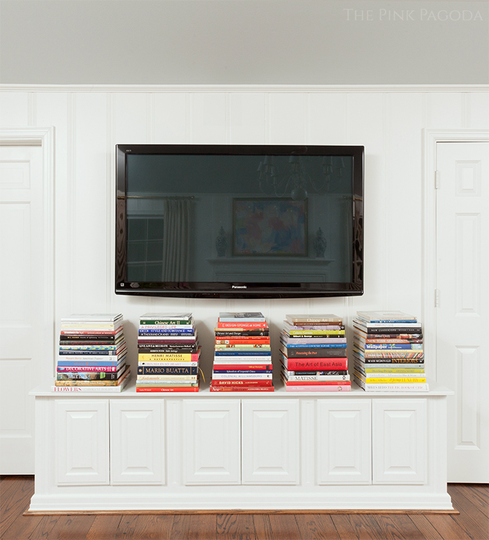
This is the wall opposite the mantle and one on which we are too often focused (blaming Netflix). The stacks under the TV are usually in disarray as I'm constantly pulling books to turn pages as I semi-watch TV. That wall would stay much neater if I learned to needlepoint.
While our family room retains the same general look as before, changes and additions were made that improve it. The removal of the ceiling fan was a huge enhancement. I'm an admirer of Meg Braff's work, and have noticed several rooms she's designed in which she used a white chandelier with white shades. It's an understated, quiet look I really like. As my house is a Colonial Revival, a Williamsburg style fixture fits right in. I found this awhile back at my favorite local consignment store, On Consignment, and had it painted white.


I should have switched the fan for a fixture when I redid this space three years ago. What a difference it makes!

The blue and white planters I had in front of each window were smaller than
. The pattern was also lighter. Having
with the stronger pattern definitely makes more of a statement.

Accessories are subject to change frequently at my house. I've used various blue and white items on the mantle through the years to flank the art. Before deciding what to use for this project, I wanted to wait until Reagan's painting was hung. Her gorgeous work has so much motion that I imagined vases with greenery or flowers as being possibly busy and less complimentary. The size of
is perfect for the mantle, and I love the acrylic bases with them.

I posted about
the book Sophistication Is Overrated
, and seeing it on my coffee table makes me happy! The authors, sisters Susan Palma and Babs Horner, are such amazing, lovely, fun, talented ladies whom I just love.
is one of my favorite additions to our family room : )
As always, it's been such a treat to be involved with ORC. Linda's idea to have bloggers finish a room together was brilliant. ORC continues to be a great experience for both participants and readers, and, oh my, how it has grown!
Very impressive, Linda!

A big thank you to
who not only photographed my project beautifully, but who was also extremely patient with my never ending attempts at fine tuning.
Be sure to go enjoy all of the amazing transformations at
.
In the unlikely event that you missed the 20 ORC participants' spectacular projects, the links are below. You won't want to miss!
|
|
|
|
|
|
|
|
|
|
|
|
|
|
|
|