One Room Challenge Week Five Ranch Renovation
Welcome to Week Five of the Spring 2017 One Room Challenge™, Calling it Home's online interior design sensation. Thank you for coming by. To catch up, go here. Things have been exciting, frustrating, annoying, fun, suspenseful, and gratifying for the past few weeks. And, I wouldn't miss it for the world. Except for maybe the part where my contractor disappeared in the middle of the job he agreed to finish and was paid for and wouldn't return texts or phone calls. Yes, that happened. It took some time to find someone else to work with, and now things are seriously down to the wire.
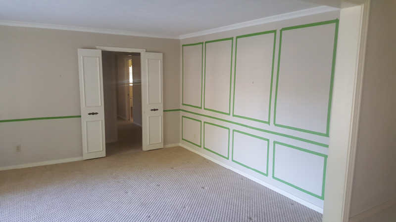
Below are a few before and after shots that show where I started, and where I am right now.
Raising the ceiling, adding gorgeous mouldings from Metrie, and installing amazing hardwoods from Allegheny Mountain Hardwood Flooring have completely transformed my formals area. Despite all the drama, I'm super excited to see this come together.
The walls, ceilings, and floors aren't the only elements of this project seeing big changes. I've done quite a 180 on the design direction. Wanting a calm, serene space, I began the project considering soft, pretty colors. My first idea was to use Chinese hand-painted panels, and I commissioned my talented daughter to create the illustration seen above for me. I loved this, but after giving it more thought, I decided the panels would be too permanent of a commitment for now.
I moved on to the idea of a soft blue and white space that would feel serene.
Snapping out of this unusual for me soft and serene phase, I became interested in blues that are a bit more vibrant. Nothing was feeling quite right, and I kept looking long after I really should have made choices and gotten everything to the upholsterer.
I've always enjoyed living in spaces that feel fresh and happy. Thankfully, I've gotten back to that, and I'm going green. Adding the crisp, beautiful, large scale Scalamandre floral, along with the green buffalo check takes this project in a completely different direction. I'm going to love it.
In the sitting room, the soft white is a Perennials fabric, and will cover a loveseat. The green Samuel and Sons tape will be fantastic on the white, and the check will cover two upholstered chairs.
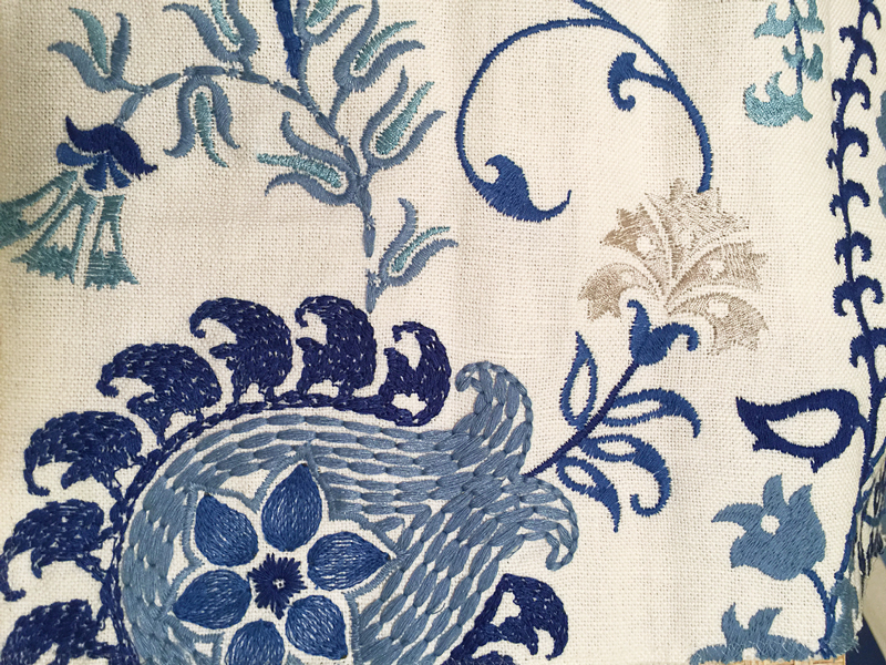
I knew I wanted a stripe on the dining room chairs, and I decided to use the blue and white shown above. Love the strie within the stripe.
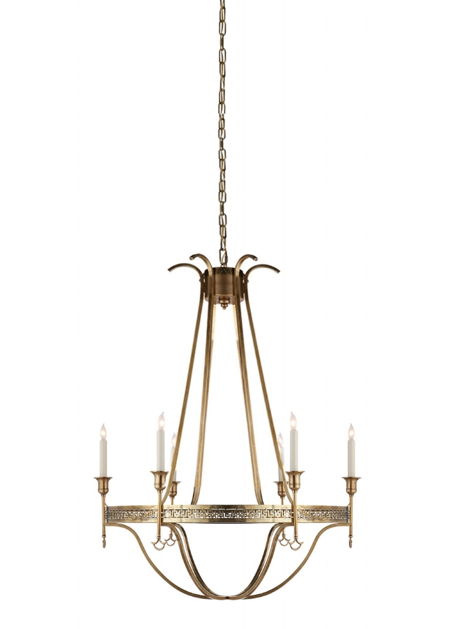
The fixture is such an influential, important element in a dining room. I've been looking and looking, and it's not easy to find just the right thing. I've felt a little like Goldilocks. This one is Visual Comfort, and I've always loved it, but it's designed to work only in rooms with 10 foot ceilings or higher. My ceilings are now 9 feet after having just raised them. I edited the image (below) to show a friend an example of what would work. Visual Comfort has not requested my opinion, but I think this would be very marketable : ).
Here's a newly designed chandelier Visual Comfort has just added. I spotted it hanging in the Hickory Chair showroom, and became intrigued. I knew the size would work, and I really liked it, but there was something about it that was making me hesitate. Finally, I realized it was the shades. It's just me -- everyone else thinks they're great -- but, I was happy to figure it out as that's an easy fix.
I imagined it with drum shades, and liked it much better. To be sure, I added some in photoshop. With what I'll have going on in the dining room, a minimal fixture is ideal, and I have someone coming to hang this later in the week. Can't wait to see it with the table from Bellacor.
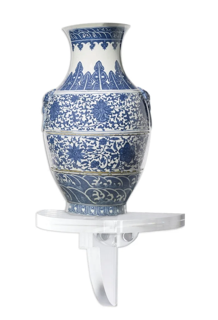
With everything else going on, I haven't had a chance to share much about accessories, but, would you ever guess that there'll be plenty of blue and white? : )
I picked up several of these wall brackets from Wisteria and plan to create a fun grouping even if I'm not sure where exactly it will be placed. The next week is going to be wild. Wish me luck!
Go visit these featured designers to see spaces that I'm sure are much further along than mine -- Eeek!
Centsational Girl | Chris Loves Julia | Christine Dovey | Dwell With Dignity
The English Room | Glitter Guide | House of Brinson | House Updated
J+J Design | Lark & Linen | Abby Manchesky | Nesting Place | Old Brand New
Old Home Love | The Pink Pagoda | Rambling Renovators | Erica Reitman
Sketch 42 | Suburban B’s | Erin Williamson
Media Partner House Beautiful | TM by CIH


