Week Three: Fall 2017 One Room Challenge
How is it that we're already at Week Three of the One Room Challenge™? Linda, our fearless leader, writes that having a rug or chair in place at this point warrants a virtual high five. Ha! Not even close over here, Linda. Maybe next week!
Thank you for checking in on my ORC. It's quite a large scale project upon which I very ambitiously embarked -- oh my goodness. I'm opening up our kitchen/family and breakfast room and creating one open space as part of an entire ranch house renovation. To catch up, go here for Week One, and here for Week Two.
Inspiration
Let's start with some pretty inspiration. These two gorgeous images are from the Instagram account of Verandah House. This mix of green and white fabric, wicker, natural wood, and blue and white is fresh and lovely. I'll definitely be drawing from this palette in my project.
Art
These absolutely gorgeous paintings are by Christina Baker, and are from her new series, Convergence, that will debut at Anne Irwin Fine Art in November. I'm SO EXCITED to share that she's creating a large painting from this series that will hang over the mantel in our family room. Christina and I worked together before, and became good friends, so having her onboard for art is actually so much fun! And, of course, she's so crazily talented, I know that what she does will be AMAZING.
I have room on either side of the new banquette in the breakfast area for a grouping of paper pieces, and Christina is creating these, too. The photo above shows one of them, and I LOVE it. I can't wait to see them all framed and hung! The art is an aspect of this project about which I'm most excited -- it's going to be spectacular! Go here to see lots more about Christina and her gorgeous work.
Lighting
I've shared that one of the highest priorities in my project was adding a significant level of light to this very dark part of the house. You can read about the covered patio that obscures most of the daylight, and catch up on this part of the renovation here.
I’m thrilled to report that my Velux No Leak Solar Powered Fresh Air Skylights are officially installed! The family room’s days of darkness have finally ended, and I could not be more excited about this transformation. The installation process was faster and much less painless than I had imagined (see video). Because these skylights are solar powered, they don’t require wiring, and the necessary roof work, framing and sheetrock repair took only a few days. Beyond just providing the solution to our lack of daylight, these skylights are SO COOL. With an amazing remote control, the solar powered skylights open and close (there’s a screen), drawing cool, fresh air into the room. And, if it starts to rain, a sensor on the skylight automatically closes with the very first drops. I had no idea that skylights functioned beyond just allowing the daylight to enter a room. I’m basically amazed by these Velux products. In the past few days it’s been cooler, and I’ve loved opening the new skylights and letting the crisp, fall air fill this space. The solar powered skylight comes with blinds which are also operated via the remote control. Velux offers many options depending on how much light you want to filter or block. They very attractively enhance the 'fifth wall’ — our ceilings — an important element of every room. I went with the white light-filtering solar powered blinds mostly because the television is never on during the daytime at my house, and I don’t need more light-blocking. So, my space is now filled with daylight, AND I can easily ventilate this large space with fresh air anytime. My ORC is far from finished, but I’m already very happy. (Photos to come, soon!)
The Kitchen
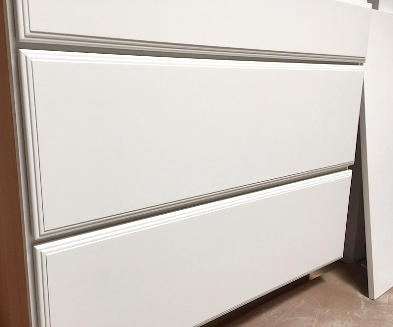
The cabinets are partially installed and should be finished Friday (better be!), and here's one of the drawer bases. Committing to a style was a little nerve-wracking, but I'm really happy with the one I chose. I worked with cliqstudios.com (catch up here), and I'll share more about the cabinetry and my experience with online cabinet shopping next week.
I really am going to close with this very unattractive image. It shows a bit of the outdated window style that graces the entire back of the house. We won't have to see this for much longer -- SO HAPPY -- and I'll be sharing about the new, much anticipated windows and patio door next week. Oh, and the brick is going to be much prettier, too.
Click through the links below to see if there are any overachieving Featured Designers who have actual furniture placement at this point.
Boxwood Avenue | Coco & Jack | Design Manifest | IBB for DWD | The House That Lars Built | Little Green Notebook | The Makerista | Making it Lovely | Old Brand New | Old Home Love | The Painted House | Megan Pflug Designs | Pink Pagoda | Erica Reitman | Sacramento Street | Simply Grove | Jill Sorensen | Sugar & Cloth | Vintage Rug Shop | Waiting on Martha * Media Partner House Beautiful | TM by ORC


