One Room Challenge Week Four
Big News!
The information below was shared first thing this morning by the creator and manager of The One Room Challenge™, Linda Weinstein.
Hold on to your hats! Instead of the usual Week Four post, we have a big and unprecedented change of plan. The One Room Challenge™ will be extended an additional week! Why, you ask?
Never have there been so many natural disasters in so many states leading up to, and during the ORC. Between Texas, Florida and California, many participants have had to endure unusual circumstances that have impacted their projects in many ways. Since its beginning, the One Room Challenge™ has been described as a place to redesign a room amongst other design enthusiasts in a supportive, noncompetitive environment. In that spirit, the ORC team believes some flexibility is in order. To best support all of the hard-working, talented designers during this challenging time, a one week extension has been granted.
Final room reveals on Wednesday, November 15th for the featured designers and Thursday, November 16th for the guests!
my response:
Hallejulah!
Because, for the first time I've ever participated in the One Room Challenge™ which is the most incredible interior design event on the internet, I was fairly sure I wasn't going to finish on time. I've had some setbacks that have been frustrating and avoidable. I'll share more about the ups and downs of home renovation under time constraints in the next couple of weeks. Wish me luck that there won't be sanding and painting just steps away from fluffing pillows and accessorizing hours before the photographer arrives!
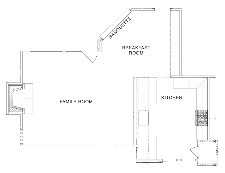
To catch you up, I'm renovating a ranch house. I did the front part of the house for the spring ORC, and this time, I'm opening up the kitchen and breakfast room to the family room. Here's Week One, Week Two, and Week Three. Below is the floor plan. Let's start the update with the kitchen.
The Kitchen
This gorgeous image is from my recent visit to The Cosentino Center, here in Dallas, where I looked at Silestone options. Sights like this were abundant, and I thoroughly enjoyed being there. From very early on in the planning stages, I knew I wanted to use Silestone, and I'm thrilled to be working with them. It's been around awhile, but if you're not quite sure what Silestone is exactly, it's a combination of natural quartz and other raw materials that are extraordinarily hard and resilient. Besides being to-die-for-gorgeous, it's a non-porous surface that's highly resistant to the staining coffee, wine, lemon juice, olive oil, vinegar, and many other everyday products can cause.
It comes in many colors, designs, textures, and finishes that you can see on the site. Below you can see the fun to be had. I clicked on the light grey and white option...
...and this is what came up.
More on this next week. I had a delay with the cabinet installation (a function of how very hard it is to find good people available right now in Dallas) and am at this very minute ready for templating. Thank goodness for the extra week!!
I shared here about my decision to work with cliqstudios.com. I forgot to mention that I'd seen their cabinetry in this project below by Brittany at The Vintage Rug Shop + Design Studio.
Now that the cliqstudios.com cabinets have been installed, our kitchen is finally coming together, and I'm so excited to see it finally taking shape. As I mentioned in a previous post, I did quite a bit of homework and chose in part to work with cliqstudios.com based on their reviews. Of all the cabinet sites I investigated, CliqStudios had what I thought to be the most authentic and highest number of reviews. Gaging authenticity isn't hard. I saw cabinet companies that had only glowing reviews. If they were to be believed, there was never a thing amiss. With orders as complex, large and fragile as cabinetry, what are the chances of a perfect track record? It may be counterintuitive, but in this scenario, a complaint or two here and there made me feel much more comfortable.
Another big plus for me was their site which is very thorough, user friendly, and incredibly helpful with a plethora of resources. I began the process working with a cliqstudios.com professional kitchen designer who planned and created renderings and elevations. There were several revisions during the process. In working with an online cabinet company, I would recommend requesting a phone consultation after the first or second revision. With my project, it was taking up to a full week for a revision, but after 30 minute phone call, the plan was in place and ready to go.
The cabinets arrive fully assembled and ready to install. The cliqstudios.com website includes everything you'd want to know about the cabinets' quality, and my expectations were definitely met. While my sparse cabinetry knowledge was just very recently acquired, my highly experienced installer mentioned several times being impressed by the quality. Visually, they’re absolutely stunning, and I can’t wait to see them paired with the Silestone Calcutta Gold countertops!
This Hansgrohe faucet arrived last week, and the picture absolutely does not do it justice. Can't wait to share photos of it installed!
The Family Room
I've mentioned that I'm going for a sunroom vibe with this project, and here are a few spaces I love.
Halcyon House
Meg Braff
Phoebe Howard
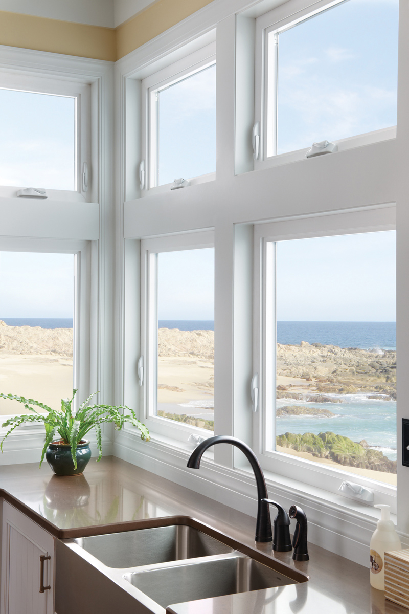
Milgard casement windows
I mentioned last week that I’d be replacing the current windows and sliding doors to our patio, and I’m thrilled to be working with Milgard on this project. The current windows in the house are quite outdated, and I truly cannot wait for them to go. I was looking for an attractive and low maintenance option for replacement windows, and Milgard’s vinyl windows fit the bill perfectly. I was planning to use french doors with divided-light, but ended up going with a more streamlined look that will work well with the sunroom vibe I'm working toward. The doors and windows are super clean, and I’m so excited to see them installed. There’s a Milgard showroom and plant in DFW, so I got to go talk with them about their products and choose my future windows and sliding doors in person. Much more to come on this once everything's been installed.
Next week I'll have lots more on the family room and the breakfast room. I'll leave you with this sneak peek of Christina Baker's painting that will go over the mantel. Click through to her Instagram and look at her story (maybe only available on mobile devices) to see a video she's sharing of the painting -- it looks SO GOOD!!
A big, huge thank you to the One Room
Challenge team for the one week extension!
Boxwood Avenue | Coco & Jack | Design Manifest | IBB for DWD | The House That Lars Built | Little Green Notebook | The Makerista | Making it Lovely | Old Brand New | Old Home Love | The Painted House | Megan Pflug Designs | Pink Pagoda | Erica Reitman | Sacramento Street | Simply Grove | Jill Sorensen | Sugar & Cloth | Vintage Rug Shop | Waiting on Martha * Media Partner House Beautiful | TM by ORC


