Fall 2019 One Room Challenge Reveal
I fully believe my One Room Challenge ™ story could be a sitcom. Before I go further, I just have to say how much I appreciate being included in the ORC, and how grateful I am for Linda’s patience as my contractor drama unfolded and resulted in my not finishing the project on time. I’m so happy and relieved to now be able to share this space.
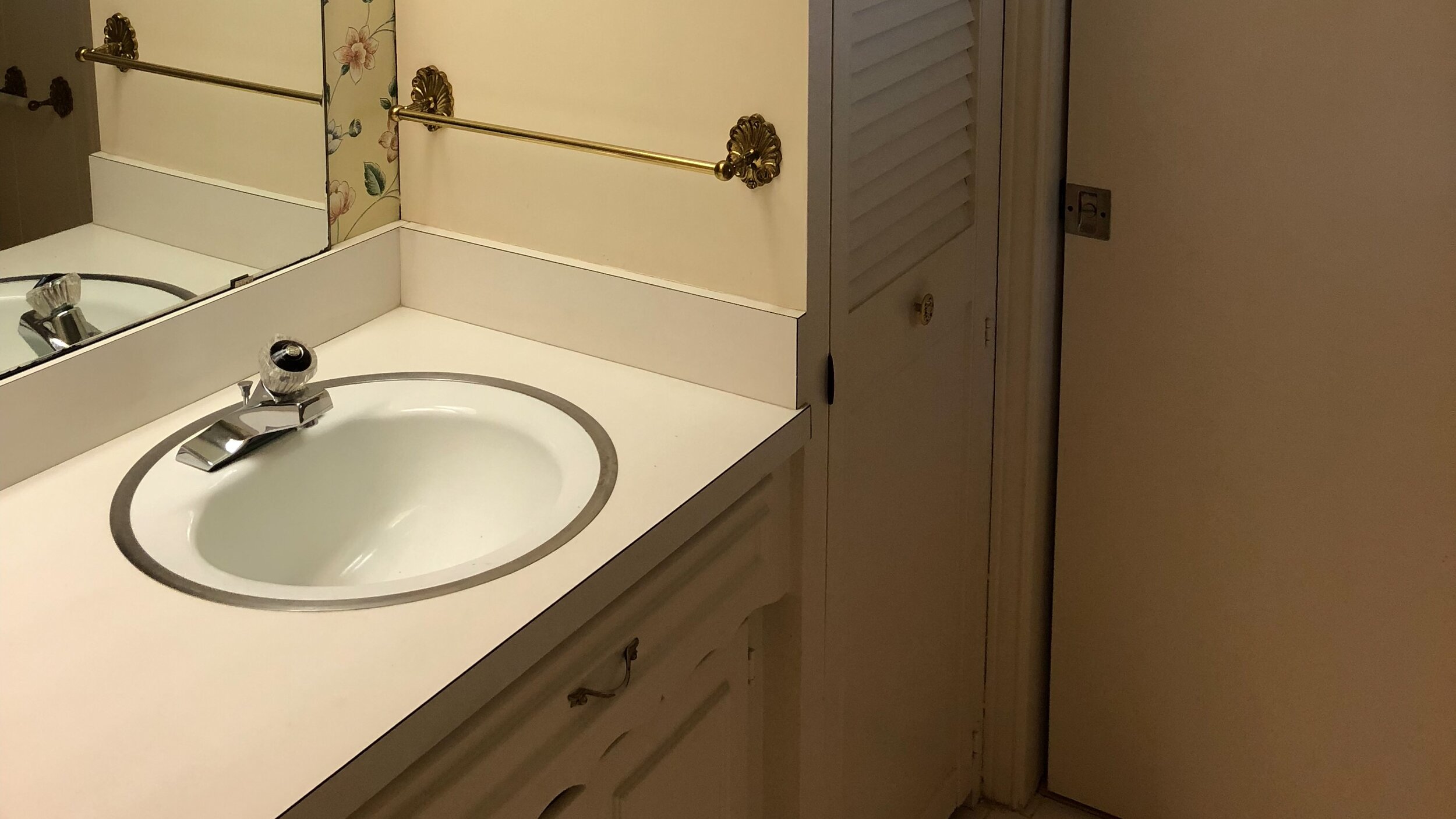
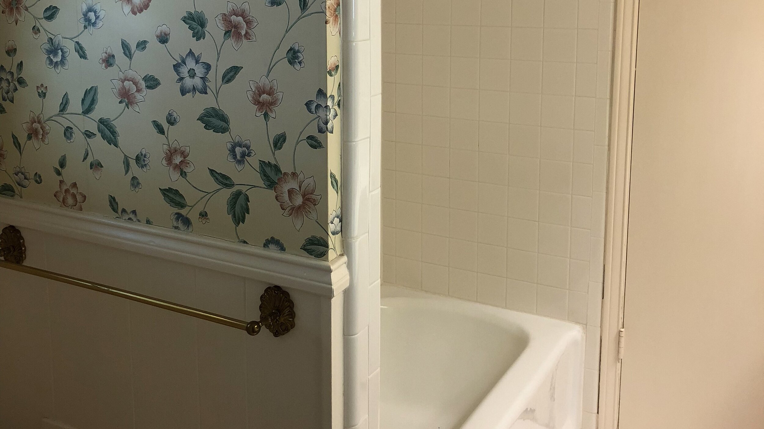
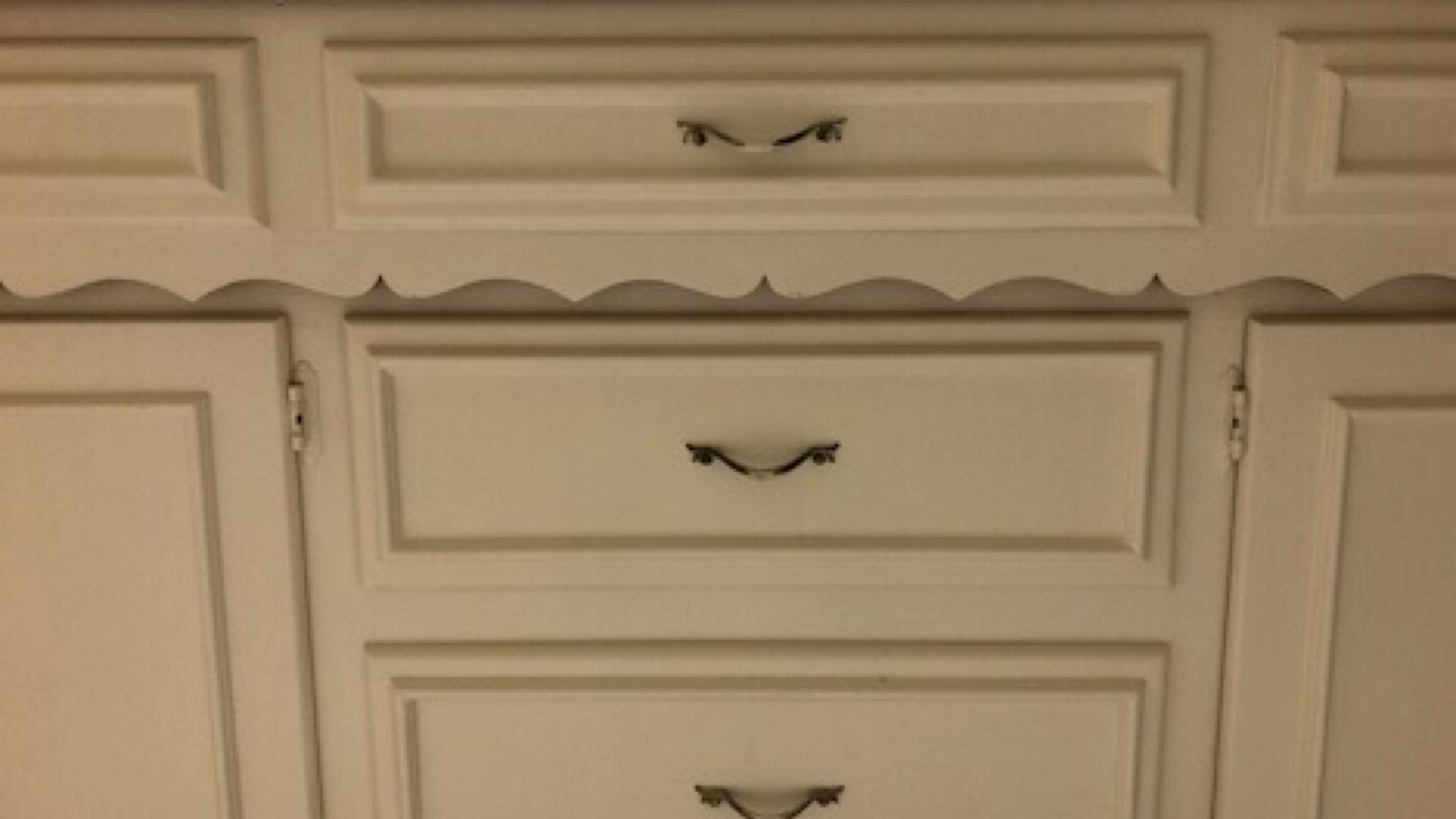
As a brief recap, this is a jack & jill bath in our late 1960s ranch house. The bathroom will be used by my 21 year old daughter and the occasional overnight guest. Our goal was to remove anything that made this room feel smaller. That meant cabinets, a partition, and a bathtub. If you’d like to see before pictures, click through the slideshow below.
Since this bathroom will be my daughter’s, she was involved with the design process every step of the way. We started with the materials required for remodeling that would also create the biggest impact. As we were removing the tub to instead have a walk-in shower, tile selection was at the top of our list. We worked with The Tile Shop, and you can read about our fantastic experience here. As soon as we saw the Bianco Puro tile display, we excitedly agreed it was beautiful and absolutely perfect for our space. We used 2x8 inch marble tiles for the walls and the floor, with crosshatch pattern on the wall and straight herringbone pattern on the floor.
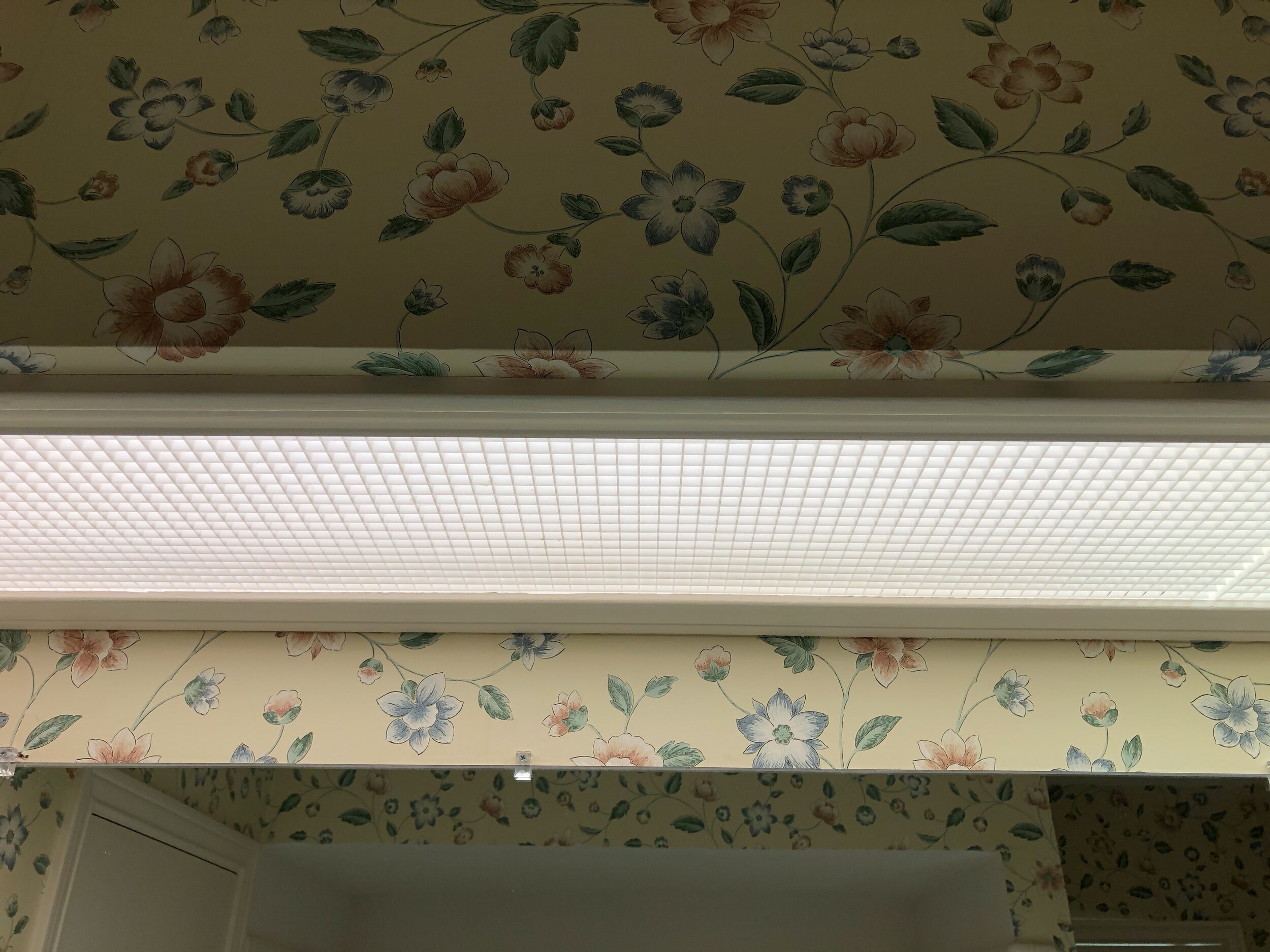
We simultaneously tackled the wallpaper, as it’s another huge design element. I had recently designed my first wallpaper pattern for this project, and my daughter and I thought it would be lots of fun to design a pattern together that would create the soft, fresh vibe she was imagining. No one will be surprised that the style is Chinese influenced and based on the peony. My daughter’s favorite color is pale pink, so that was the obvious color choice. For my previous wallpaper design foray, I worked with Milton & King, whose paper is beautifully printed and very high quality. I absolutely wanted to work with them again. We were jumping up and down with excitement when it arrived in the mail. Here it is below.
The original wall-to-wall cabinets had been removed during the remodel, and we immediately could see how much more spacious the room felt without them. So many people are using vanities instead of built-in cabinets now and there are many from which to choose. We found the Wyndham Collection Berkley White Vanity and knew it would work perfectly with the design we’d planned.
Next on our list was the shower enclosure. We were so enamored with the tile and did not want anything to detract from the prettiest marble we’d ever seen. I talked with several companies and was most impressed by DFW Bath & Glass. Between their product, which was obviously high quality, and their incredible customer service, they were the clear choice. When they came to measure and provide an estimate, they were very detailed and friendly and took lots of time educating me about shower enclosures, about which I previously knew nothing. I chose the clear, colorless glass so that we could enjoy the true marble color instead of seeing it through the slight green tint in regular glass.
We needed the shower enclosure to basically disappear and even chose a handle toward that objective. I have to say, the shower enclosure situation could not have gone more smoothly. Working with DFW Bath & Glass was very pleasant and easy, and the enclosure is absolutely gorgeous.
Here’s the floor of the walk-in shower. I asked the people at The Tile Shop to help me with the curbing and floor tile, and I love what they put together for me.
During our recent kitchen remodel, I had a Hansgrohe faucet installed. We’ve loved the way it looks, feels, and works and were determined to use their products in this project. We chose the Radiance shower head, ShowerPower Wall Supply, ShowerSelect control, Unica slide wall bar, and Techniflex hose and not only are they gorgeous, but they work beautifully as well. It’s so nice to just touch a button and have the shower water start to the temp you like, and the shower setting RainAir is wonderful.
In this image you can see the shower fixture through the reflection and the Hansgrohe sink fixtures we chose, too. We were wanting to mix traditional and modern styles in this room, and love the minimal design of these fixtures.
I have a thing about mirrors. The right one can absolutely make a room. I was looking for a traditional style that was also extremely minimal and had a mirrored frame. In my search I came across the website Mirror Image Home. I think it has the best mirror selection I’ve ever found. There were three or four that fit our criteria but this Arc Mirror was the stand out. Have to say when it arrived I was super impressed with its packaging and actually gasped when I opened the box. It is somehow even prettier in person. The over-scale size is very impactful and helps to make the room feel larger.
For lighting I went straight to Hudson Valley Lighting. Between the different lines they carry, I knew they’d have everything we’d need. We hadn’t had previous experience mixing metals in a bathroom, but were determined to make it work in this space. We wanted a satin brass finish for both the sconces and the overhead light. The Guthrie fixture is just the thing for an eight foot ceiling. Somehow it’s both incredibly minimal and a head turner. This bath project was my first experience selecting more modern design elements and I felt a little nervous. The overhead light fixture was probably the most modern choice we made and it couldn’t be better.
The sconce choice was harder. The Hudson Valley Lighting site has just so many fantastic options, and it was very hard for us to choose a pair. We finally decided that these Amherst sconces were such a great combination with the Guthrie fixture. We’re thrilled with all the lighting.
On the other side of the room, I replaced a built in linen closet with this etagere from West Elm in keeping with our goal of making the room feel as large as possible. There were strict space restrictions for the etagere — we had to find something no wider than 17“ and this one worked with the spacing. Full disclosure — when it arrived the brass was far darker than the product photos made it appear, so I painted it to match the lighting fixtures more closely. The etagere is the perfect solution for towel/toiletries storage.
This art makes me so happy. My daughter is getting a second degree in Studio Art, so I commissioned her to create something that would work in this specific spot.
The technique she used to make this is original and interesting and the colors work beautifully with the wallpaper. I enjoy the art so much more because it’s something my daughter created.
Both the pocket door handle and the toilet paper holder shown below are from Emtek, and fortunately the brass finish on these is fantastic and is cohesive with the other brass in the room.
Earlier I mentioned we were determined to mix metals. The vanity comes with chrome pulls, which we switched out for these brass pulls from Schaub and Company. I had used Schaub and Company knobs on all of my kitchen cabinets and was so happy with them so I obviously went straight to them for hardware in this bathroom. They look great with the rest of the brass in the room and are balanced by the chrome sink fixtures right above it.
This doorknob is also from Emtek. With the acrylic shower handle and the acrylic on the vanity pulls, this doorknob was a no-brainer.
All the brass all looks nice together and has the same finish as the Hudson Valley Lighting fixtures and works well together. The light switches and outlets are Legrand’s Adorne series. I have Adorne in my family room and kitchen and would just like to have them everywhere in my house. They offered an option that has a backplate that can be wallpapered, and I loved how you can minimize the light switch and see more of the paper pattern.
This bowl is something else I forgot I had. I was looking for something to put guest soaps in and it seemed perfect.
I had an extra shelf on the etagere and needed something decorative so I just rolled up some washcloths and put them in this dish that I had. It also looks really pretty on the vanity countertop. It really was something I came up with for these photos but I’m going to remember this idea for the next time I have an overnight guest.
Lastly, here’s a guide of everything I used in the room with links below. Also, be sure to not miss my daughter’s tour of her bathroom at the very end of the post. Thanks so much for checking back to see how everything turned out, and a huge thank you to Linda for making this event possible. The One Room Challenge™ is my all time favorite design event! My daughter and I waited a long time for everything to be complete and it was well worth the wait.
1: Bianco Puro from The Tile Shop
2: Wallpaper created by me, printed by Milton & King
3: Art by my daughter, coming soon
4: Hudson Valley Lighting Guthrie Single Light 13"
5: Hudson Valley Lighing Amherst Sconces
6: Legrand Adorne Series outlets and light switches
8: Emtek Modern Disc Crystal Privacy Door Knobset with Brass Rosette
9: Emtek Modern 18" Solid Brass Towel Bar (similar)
11: Hansgrohe Radiance shower head, ShowerPower Wall Supply, ShowerSelect control, Unica slide wall bar, and Techniflex hose
12: Mirror Image Home Arc Mirror


